Race Day: five posters for races that never happened
Every race in this series is invented. That sounds like a limitation and it is the point: a real livery pins a poster to one season and one sponsor, and it stops being current almost immediately. An imagined race does not date, and it needs nobody's licence to hang on a wall.
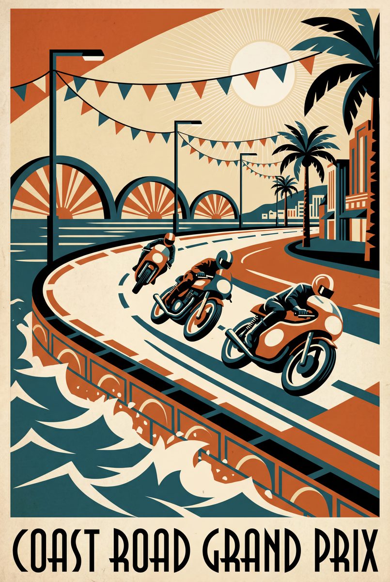
Racing artwork is where the licensing problem bites hardest. Reproduce a real team's colours and you are selling somebody else's brand; reproduce a rider and you are selling their likeness. So this series does neither. What it keeps is the thing people actually want on a wall, which is the atmosphere of a race day rather than a record of one.
The loud ones
Coast Road Grand Prix is a fictional 1962 seaside road race in art-deco poster style: leaning machines, salt air, bunting stretched in the wind. The Sprint catches the flag drop at a standing start, speed lines and grit in a vintage race-poster palette. Both carry bold flat colour, so they hold a wall from across a room, which makes them the ones for a garage or a workshop.
The one that climbs
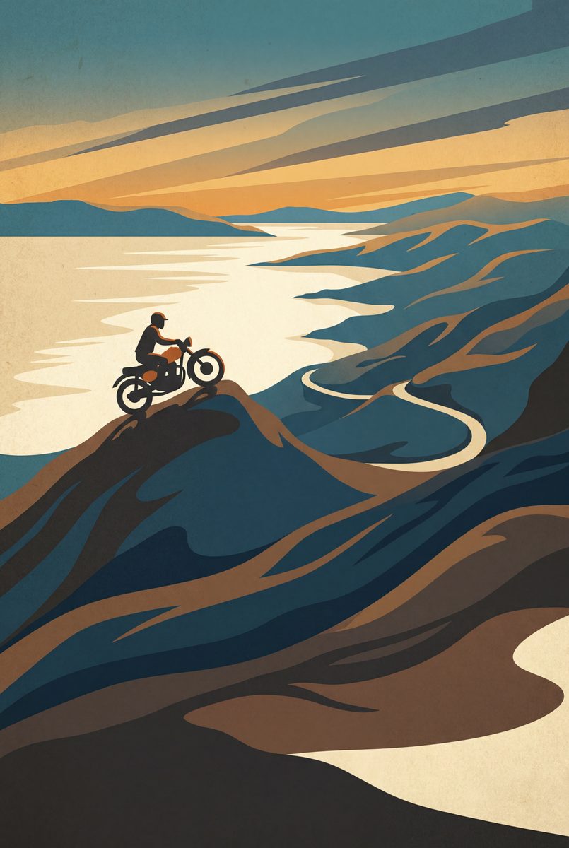
The Mountain Course is an imagined island road race climbing through deco-styled peaks: the climb, the cloud, the drop. It is the closest this series comes to landscape, and it suits somebody who follows road racing rather than circuit racing.
The quiet ones
Night Trophy is a headlamp beam carving a dusk corner with marshal lamps strung above, the day's last race. Paddock Morning is mechanics around a bare racing machine before the off: quiet, cold, all promise. That second one is the connoisseur's pick, and it is the one worth suggesting to somebody who already owns a wall of action shots. Most collections are all leaning machines and no paddock.
Go bigger than you think
Deep flat colour rewards scale in a way fine line work does not, and these five are the artworks on the site that most reward it. They are built to be read at ten paces, which is why they hold a workshop or a garage wall where a delicate ink drawing disappears. If you are choosing between two sizes, take the larger one here.
On framing: black rather than natural wood, almost always, because the palette is already supplying the warmth and a wood frame makes it sweet. The framed print page covers both, poster covers the paper, and canvas is the frameless route.
The road posters are the other half of this argument, for the rider who would rather have somewhere than something. Gifts for motorbike lovers covers buying this series for somebody who follows the sport without riding.
Written by Craig Fearn, Throttlefolio. Last updated .
Workshop notes
Questions, answered
Are these real races?
+
No, and deliberately not. Each poster is an invented race painted in period style, which is why none of them carries a team, a rider likeness or a circuit name. It also means none of them goes out of date.
Which racing poster suits a road-racing fan?
+
The Mountain Course, an imagined island road race climbing through stylised peaks. It is the one in the series that reads as landscape as much as sport.
Which is best for a hallway rather than a garage?
+
Paddock Morning. It is the quiet one: mechanics around a bare machine before the start, so it hangs in a room where a leaning bike at full colour would shout.